


Spaces
Stylishly Break the Rules of Wall Art
Gallery walls are all the rage, but instead of feeling bound by balance, color and pattern, don’t be afraid to break the rules for an even more stylish look.
By Ettie Berneking
Nov 2017
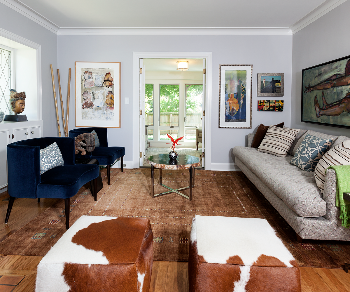
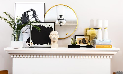
Photo by Brandon AlmsTerri Martin chooses art pieces that she can connect with and designs the rest of the room around the art on the wall.
Take a deep breath. Hanging up your favorite piece of art doesn’t have to be as difficult as you think. Yes, there are some helpful guidelines when it comes to height and scale, but beyond that, it’s really up to you. For some helpful tips on how to break through the common writer’s-block of art arrangement, we turned to two pros. Terri Martin is an avid art collector who has filled her walls and even a few storage units with her collection, and Nathan Taylor is partner and principal designer at Obelisk Home who has helped many clients artfully arrange and frame their most prized photographs and art pieces.
Embrace the Gallery Wall
“Creating a gallery wall is a great way to mix frames, colors and subjects. I work to space each picture as close to evenly as possible without making it look like you bought the collection together. A typical rule I use is to start with a center picture. It might not be centered on your wall, but it’s what centers the collection. Build out vertically and horizontally from there.”—Nathan Taylor
Keep Proportions in Mind
“The biggest mistake I see is when people leave too much space around art. They hang one small piece of art above a couch but leave the rest of the wall blank.”—Terri Martin
“Yes, there are guidelines, but it doesn’t have to be a hard-and-fast rule. As a designer, I’m a big believer in scale and proportion. These are the most misunderstood guidelines about hanging art. I love overscaled art. It can make a space feel more intimate. I like to do a really big piece of art in a small space. If it’s above a mantel, I use a sculpture or vase next to it to give it depth and dimension.”—N.T.
Don’t Limit Yourself
“Photographs help fill space, but mirrors and empty frames do the same thing. They can mix well with your art collection. Even framed baskets and box lids—think outside the box in order to display what you love.”—T.M.
Art Shouldn’t Just Fill Space
“Everyone can have the same furniture, but art makes it your space. Find what’s appealing to your eye. Even if it’s just the color. Art should speak to you or connect with you in some way.”—T.M.
That Unfinished Look is Great
“I much prefer a piece of floating art in a really deep frame where you can see the unfinished edges.”—T.M.
“I use a mix of matted and framed pieces. I love to see the handmade characteristics of art, so I like floating pieces as well.”—N.T.
Break Away From the Well Known Artists
“I think the point of having wall art is to support artists and to find what’s appealing to your eye. I’ve found art at flea markets and church sales, and I’ve even met some of my favorite artists through eBay and email. Local galleries are a great place to discover new artists you love, and buying local art always makes me feel more connected to the area. You can even showcase photographs and kids’ art. I would rather frame kids’ art than buy a cheesy print. That’s true art!”—T.M.
Break Away From Scale
“Bigger can be better when it comes to art. A giant piece of art can make a small room feel bigger and a big room feel smaller. The key is to put that art where it makes the most impact.”—T.M.
Don’t Stick With a Theme
“A lot of people try to match their frame matting to their furniture. You can decorate within a theme, but your art doesn’t have to match. Pick what you love, and it will come together.”—T.M.
“There’s nothing worse than themed art. When selecting art, don’t be afraid to use art that’s a different color or subject than your decor. One thing I think most people do is they choose art that matches their colors. You don’t have to do that. Art is very personal, and I think people forget that.”—N.T.
Don’t Hang Art Too High
“People always hang art too high. The museum standard is to measure 58 inches from the ground to the center of the art. That’s how high it should hang.”—N.T.
“We hung five little decorative plates, and they were an inch too high. I noticed it right away. Always start lower than you think you should be. It’s easier to hide holes if you have to move higher on the wall.”—T.M.
Pick a Goal
“If you want clean lines, select frames that are similar sizes and shapes. If you want a more eclectic aesthetic, group frames that are different materials. I’m not a fan of ornate frames, but one of my favorite watercolors was in an ornate gold frame. It actually looks great next to my other simple frames.”—T.M.