


Lifestyle
Warm Up Your Home
Mother Nature isn’t the only one who refreshes her palette every autumn. Here are some festive colors to work into your home as 2014 enters the home stretch.
by Matt Lemmon
Oct 2014
Fall is here, and with it an inevitable breath of fresh air for the world of interior design. Summer’s bright whites and clean lines make way for richer palettes and textures, which can incorporate tried-and-true favorites as well as colors on the cutting edge. We talked with Sharon Cates, color specialist for Seminole Décor Center (1815 E. Seminole St., 417-881-5559, seminoledecorcenter.com), about some of her favorite fall colors, how they can be used and who might be interested.
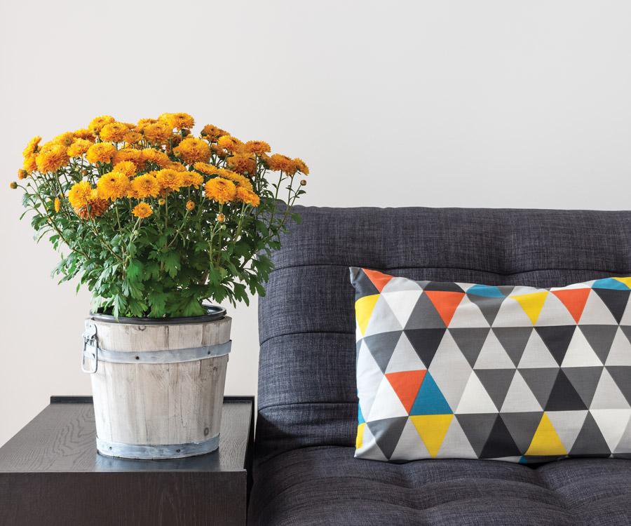
1. Warm Grays
For every bright pop of pink, a discerning decorator naturally will need to pick a neutral to make it stand out. And right now Cates says she’s really into warm, textured grays, particularly when used in fabrics, pillows, furniture and rugs. It’s in line with the overall design trend of simplicity, and the right texture can give even a neutral color like gray a lot of additional dimension. Find the right neutral, and it becomes easy (and less costly) to change out the brighter pops of color as the seasons, and trends, change, according to Cates.
![]()
2. Clear Corals and Blues
Cates, who has a BA in art, plus additional degrees in both color therapeutics and feng shui, says color can be affected by everything from an individual’s hair color and the mood of the country to the type of area we live in. “If you’re urban, country… those palettes tend to change,” Cates says. But some things are universal, and right now, when it comes to adding an accent color, the key is to go clear. Turquoise blues, not gray-blues; or bright, remarkable corals, not dusty ones.
3. Radiant Orchid
Also known as Pantone color 18-3224, Radiant Orchid was voted color of the year for 2014. And while Cates admits it isn’t her personal favorite, she acknowledges its popularity and its usefulness in décor. “Color is a very personal thing,” says Cates, who urges people to consider their personality and even their own style before making a decision. “People with red hair, that palette is very flattering to them, and it’s fun to work with a person who you know has that palette, and it works for them.”
4. Sophisticated Metallics
Cates says many formal spaces—dining rooms, parlors, et cetera—are moving away from shinier metallics like brass and silver and toward a richer look incorporating brushed nickel and burnished or oiled bronze, which give fixtures and ornamental elements a more lustrous, but more subtle, look.
5. Bright Yellows
Naturally, the world of fashion and culture will play a role in interior design trends, and yellow has benefited from the fashion choices of some of the world’s most photographed celebrities. Cates points to buzz-worthy dresses worn in recent years by Michelle Obama and England’s Princess Kate as harbingers of the color’s year-round popularity. “Yellow is a color of courage and hope,” Cates says. “It’s a showstopper. But you still have to put it in with a lot of neutrals for it to shine. If you put all the [bright colors] together, it’s way too confusing.”