


Home Profiles
Best Use of Space
With some creative planning and ingenuity, Nathan Taylor of Obelisk Home managed to make the most of an awkwardly shaped space and give these homeowners a workout room as well as a guest bedroom.
By Jamie Thomas
Nov 2020
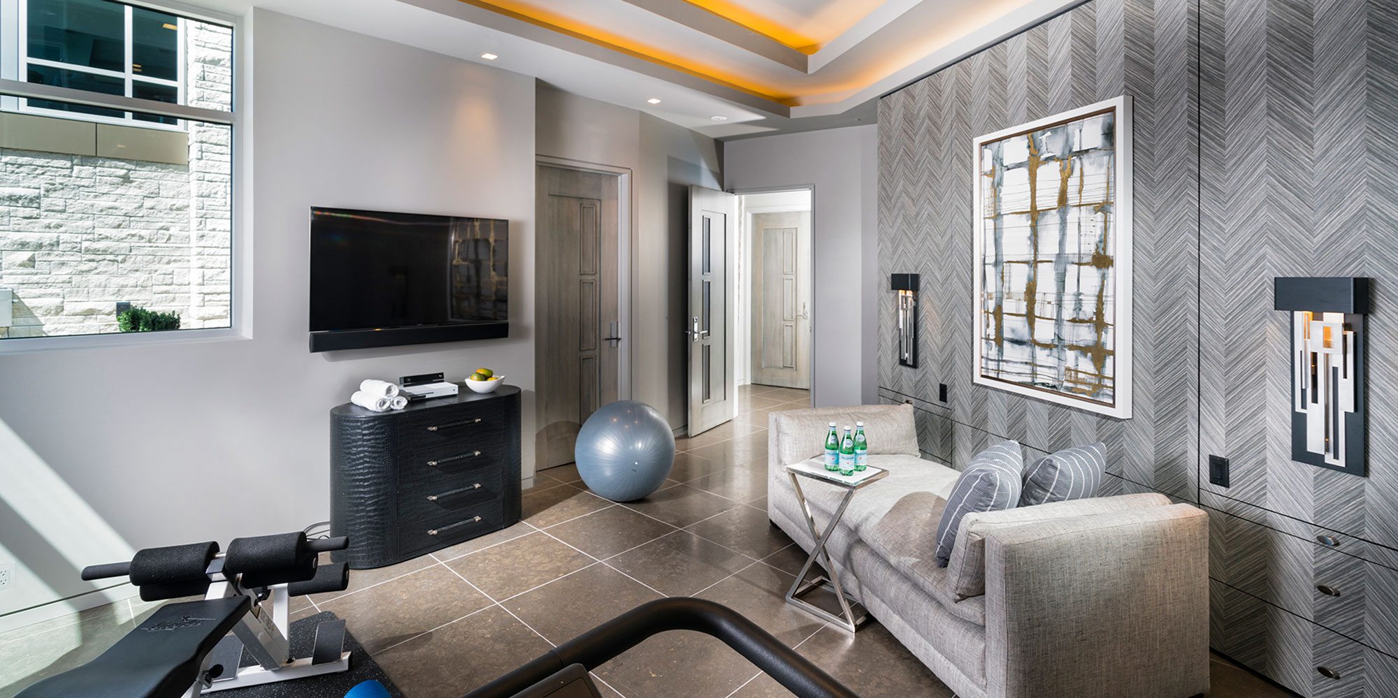
Photo by Jeremy Mason McGraw, Global Image Creations and Colby KernCreative use of limited space allowed Nathan Taylor to craft a workout space that quickly and easily doubles as a comfortable and welcoming guest bedroom.
WINNING DESIGNER: Nathan Taylor, Obelisk Home
PROJECT GOAL: To use the limited space to create a high-end-gym environment that can easily switch between a convenient workout area and a stylish guest room, complete with all the usual amenities you could need in a bedroom. This needed to be done while fitting perfectly with the new property’s overall aesthetic and limiting the need to move furniture around as much as possible.
For the workout room at this newly built property, the homeowners wanted to be able use the space available in the guest bedroom as a workout room when unoccupied. “[The homeowners] wanted to have a bedroom and a workout room combined into one,” Nathan Taylor of Obelisk Home says. “The challenge was how do we make it function as both without having to move out all of the exercise equipment to make the furniture work.”
The owners also asked for the space to be bright, with plenty of light and a balance between feeling like a room for working out and a room for sleeping and relaxing with a few simple changes, says Taylor. “And they wanted the bathroom to feel very spa-like,” Taylor says. “That went with all the white, the light neutrals and the natural material.”
Photos by Jeremy Mason McGraw, Global Image Creations and Colby Kern
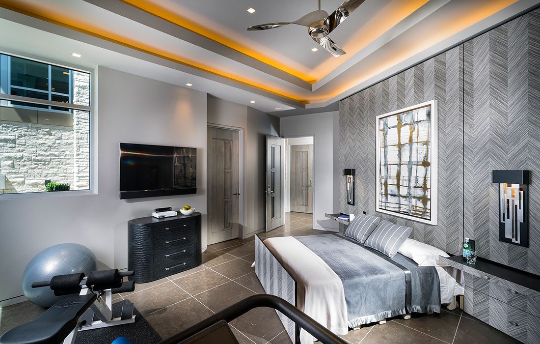
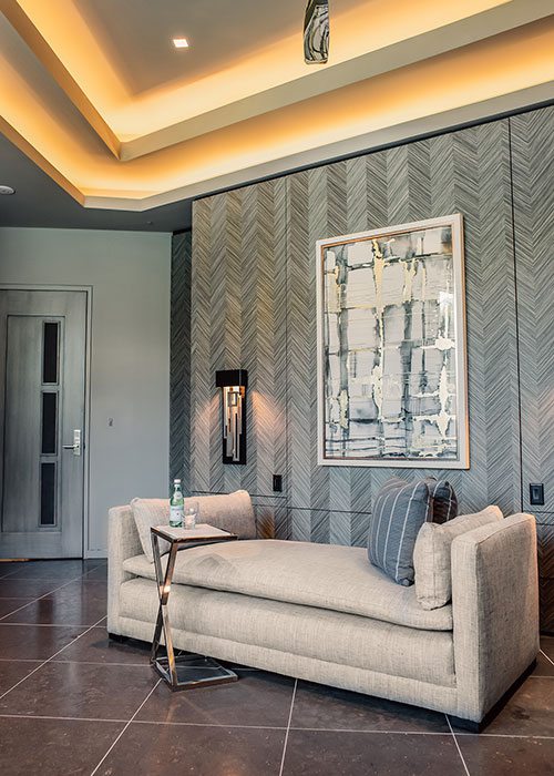
Photos by Jeremy Mason McGraw, Global Image Creations and Colby Kern“The original concept was to create a Murphy bed that could be lifted up out of the way and then brought down,” Taylor says. Ultimately, the solution became to have the bed disappear into the wall entirely. “We created a wall and put a beautiful wood veneer wallpaper on it [...] We wanted them to disappear and be concealed as much as possible.”
Part of the difficulty in using the limited space to create a multi-purpose room was the angle at which it’s positioned, according to Taylor. “It’s part of the architecture from up above,” Taylor says. By using bold, straight-lined designs, like the chevron patterns on the wall, Taylor was able to offset the angle and small size with eye-catching designs.
That style, says Taylor, is unique to that room. “Everything else in the property has a little more gracefulness to it,” Taylor says. “We wanted [this room] to feel bigger and that’s where we wanted to come up with the hardest lines to help define the space. We didn't have any way to put any other interesting [patterns]; we can't put back pillows or put lamps or anything to give it the additional dimension.” Along with adding some visual interest, the sharp lines and bold patterns help to evoke strength as well as make the room feel bigger, according to Taylor. “I wanted it to feel like you were in a really high-end gym.”
“I think the biggest challenge was getting the substrate all built so the pullout trays for the nightstands functioned properly,” Taylor says. “The original concept was to create a Murphy bed that could be lifted up out of the way and then brought down.” Ultimately, the solution became to have the bed disappear into the wall entirely. “We created a wall and put a beautiful wood veneer wallpaper on it [...] We wanted them to disappear and be concealed as much as possible.”