


Life
Q&A with Graphic Artist Frank Norton
Frank Norton has done graphic design and illustration for companies in 417-land and beyond. We asked Norton about his work and his influences.
by Jamie Thomas
Dec 20 2019 at 8 a.m.
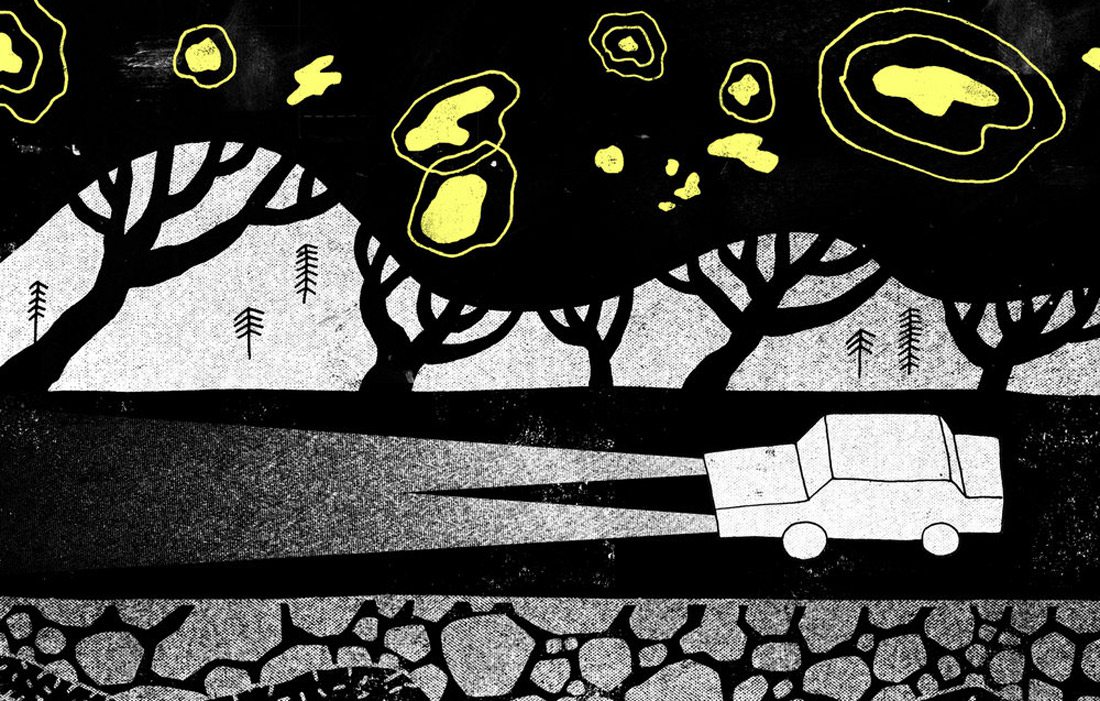
Image courtesy Frank NortonSpook Light by Frank Norton
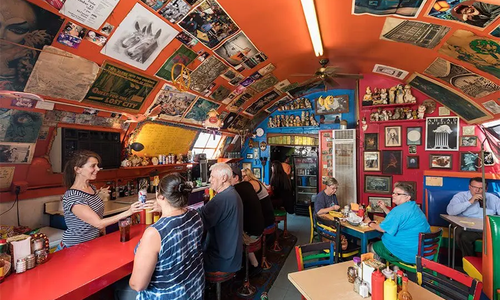
You’ve seen Frank Norton’s unique designs all over 417-land. Best of Luck Beer Hall, Golden Girl Rum Club’s menu, Boulevard Brewing Company’s labels and now Lucky Tiger Sandwich Company. We spoke to Norton about his creative process, inspiration and his Ned Flanders tattoo.
417 Magazine: How did you get into graphic design?
Frank Norton: I've always been interested in art and drawing, even in school and as a really little kid. As you come of age and try to figure out what your career path is going to be, for everyone who's into art, there's an encouragement to go into graphic design and commercial art. I grew up in Springfield and went to MSU [Missouri State University] and I knew I either wanted to go into teaching or graphic design. I had met with teachers from both departments and I was really charmed with all the professors in the design and illustration department. I felt really fortunate to meet the instructors who helped to cultivate that interest in graphic design and illustration and how to blend the two. My peers at the time, too, are where I got a lot of motivation to pursue a creative career, getting inspired by the work they were doing.
417: How did your style develop?
FN: I graduated during the recession, so there was a sense of needing to serve whoever I worked for. A lot of studios and ad agencies run on the idea of 'whoever walks in the door with money, you have to do what they want.’ There's a business reality to it and you want the client to be happy, but early in my career, like a lot of young designers, I was encouraged to have multiple styles to make it more about being a jack-of-all-trades. It's taken me awhile to find the confidence to realize that my own hand with illustration is what makes me unique, and I stand to have better partnerships when people hire me for being an individual, not a generic graphic designer.
417: Do you have any specific influences?
FN: That's always a tough question because my inspiration is always changing. Growing up in the '80s, it was this cool time of very wild subject matter, like Teenage Mutant Ninja Turtles, all the Jim Henson Production Company’s puppets and animation, a lot of stuff inspired by comic books. Even the horror movies coming out of the late '80s. There was an emphasis on things that were hand-made at that time, but also it seemed like no one was holding back. We sacrificed a little bit of perfection for the celebration of individualism, things that were a little bit more tongue-in-cheek or off-the-rails. I think those things represent what I'm doing today, to question what a label or a menu is supposed to be.
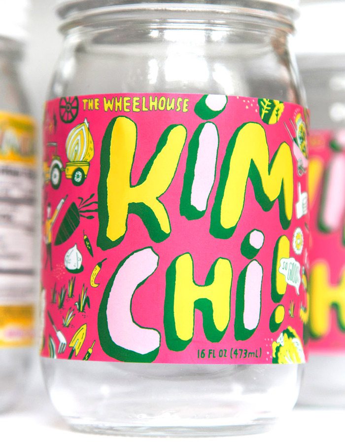
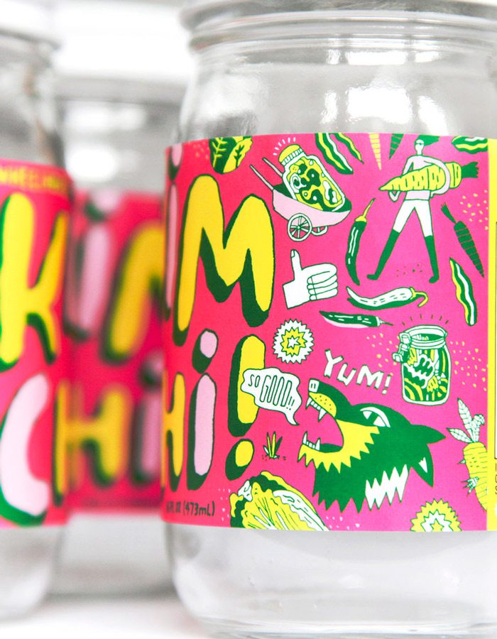
Photo courtesy Frank Norton
The Wheelhouse's Kimchi label was designed by Frank Norton.
417: What do you use to illustrate?
FN: I always start with pencil sketches. I think the older I get the more I realize my first sketch is so much better than if I keep redrawing it. That first idea and how it hits the paper. I try to stick to basic materials, pen and ink, pencil drawings. I'll bring those into the computer and make it more functional for production, that way I can create a library asset for the client. But all of it starts with tactile materials. I'm always afraid that I'm not opening myself up enough to contemporary tools like tablet drawing or digital drawing, so I've been trying to learn that since I have a fear of not experimenting enough or becoming complacent. But I think I'll never really change my process, I'm only kind of expanding.
417: What was the first piece you did that was a big deal to you?
FN: There was a design exhibition in Kansas City that was put together by the American Institute of Graphic Arts [AIGA] in 2014. They asked me to create the poster design, invitations and all the assets. They basically let me do whatever I want, it was one of the first professional projects where it was totally open-ended. That gave me encouragement, that the local design community is supporting me taking my own approach. Any time I'm allotted that kind of trust it's humbling, but if other people have that kind of faith in me then I should have that kind of confidence in myself.
Also, working with Rogan Howitt with the Golden Girl Rum Club. It was a situation where he said "do whatever you want." He gave me a really long leash and let me go wild with it. I went to a bar in Mexico City where the menu was almost like a ‘zine, like this underground comic. I was really inspired by the idea that a menu doesn't just have to be items and prices. That was one of my favorite projects to date. Before those two, I kind of just had this feeling that I need to put my own vision in the backseat. Those situations made me realize I do better work when I'm really inspired to pull out all the stops.
417: Is there an artist or illustrator that you'd like to collaborate with?
FN: Most often, the people I like working with are new businesses where it's a new concept and it's just starting up. I feel like that's what I built a lot of my work on-people trying to establish their own identity and do something different. I think it would be fun to brand something totally different. I do a lot of food and beverage, but hospitality and entertainment are kind of a natural extension for that. Creating an identity for a movie theater or an arcade. I worked with Get Dusted and that's been one of my favorite projects, too.
417: You live in Kansas City now; how often do you visit Springfield?
FN: Probably every other month.
417: What are your favorite places in town?
FN: At the risk of sounding like shameless self-promotion, our favorite bars are the ones I've worked with, too. The Golden Girl Rum Club—they have excellent food and it's such a unique bar. Best of Luck Beer Hall—let me name some that I haven't worked for. I really like Casper's. Skully's Food Truck, Druff's. There's a food truck off Republic Road called Shrimp and Bayou Classics, it's really off the beaten-path [editor's note: unfortunately Shrimp and Bayou Classics is now closed). I really like going to Mother's Brewing Company's tasting room.
417: Can you tell me about the Ned Flanders tattoo?
FN: That was at a tattoo shop in Kansas City. They were having a Friday the 13th flash sale, and that was one of the options.
Take a look at some of Frank Norton's original art and the Ned Flanders tattoo (Ned as the devil from the 1993 Halloween episode of The Simpsons...in case you were curious) below. You can find more art or contact Norton via his website.
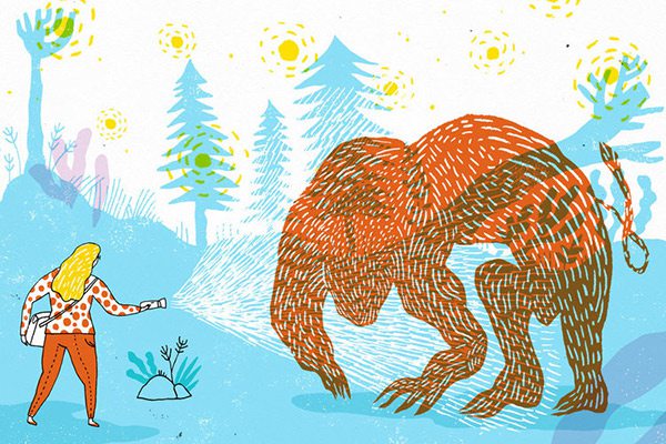
Images and photos courtesy Frank NortonOzark Howler by Frank Norton
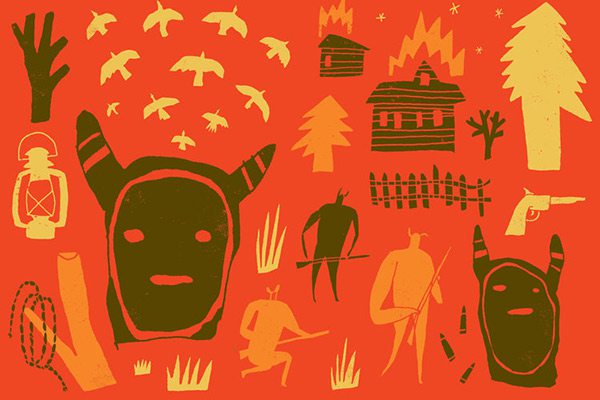
Images and photos courtesy Frank NortonBald Knobbers by Frank Norton
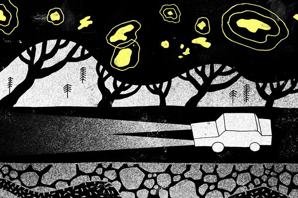
Images and photos courtesy Frank NortonSpook Light by Frank Norton
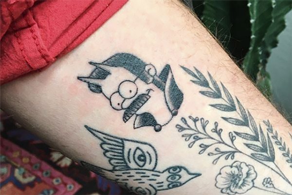
Images and photos courtesy Frank NortonFrank Norton's tattoo of Ned Flanders from The Simpsons.